Brief:
We were briefed to develop a new logo and associated sales collateral to launch the new standalone UK Collective company and create a unique identity to separate it from the US Collective, and to reinforce our positioning on premium brand digital rich media and creativity.
Solution:
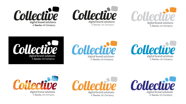
We worked up a range of logo lockups, initially in black and white to focus on form and structure. Once we had a short list of final logo designs we introduced a colour palette of strong base colours with supporting accent colours. Once the final logo was chosen we created a whole family or colour combination/versions for use with different product sets.
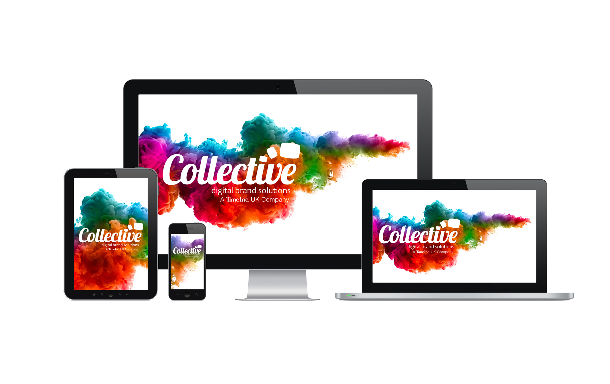
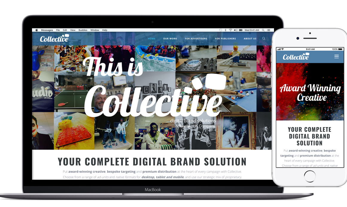
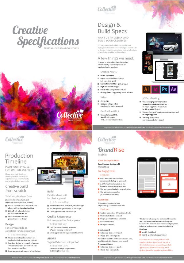
The new logo set was supported with a branding style based around clouds of coloured ink to reinforce the idea of creativity and action. This was used to develop the new website, spec sheets and sales collateral.


Results:
The final logo used a modern, flowing, creative font called Lobster with ‘3 screens’ cascading away from the ‘dot’ on the letter ‘i’, underneath this was the strapline ‘Digital Brand Solutions’ a phrase the company came up with on an away-day strategy and planning session, which we all felt distilled what we stood for.
This was then used to develop a sales deck, ad-specs a new website and supporting one-pager collateral.